Christopher Nolan Time Series
Book Covers
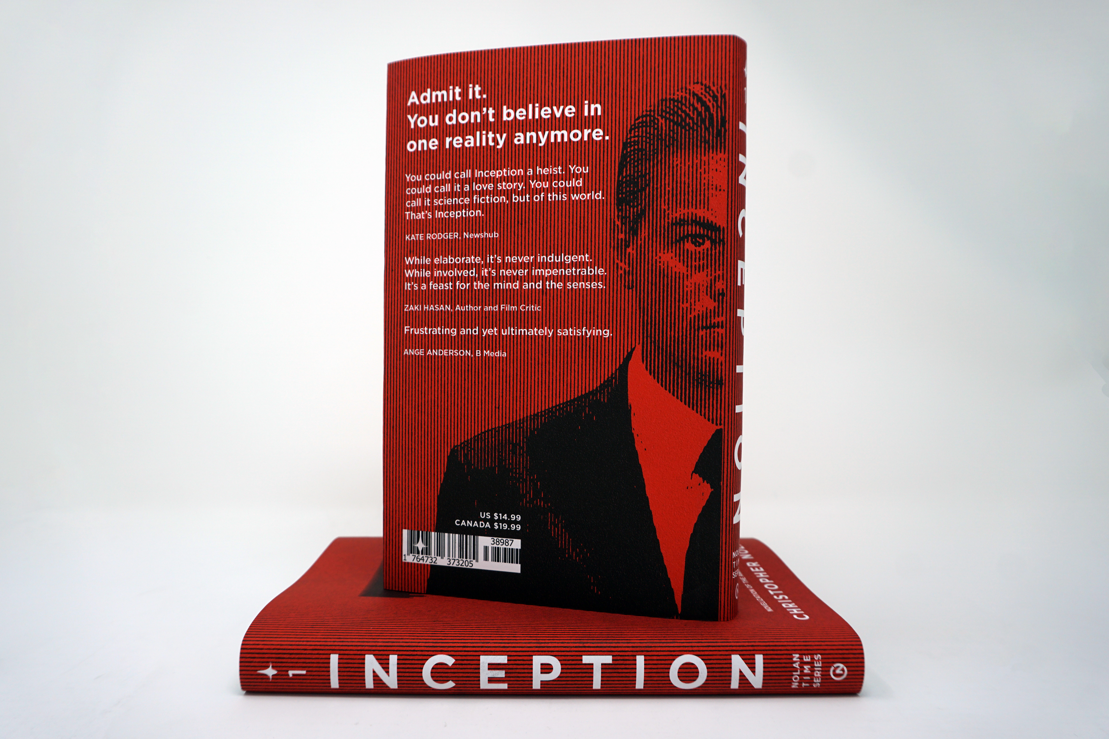
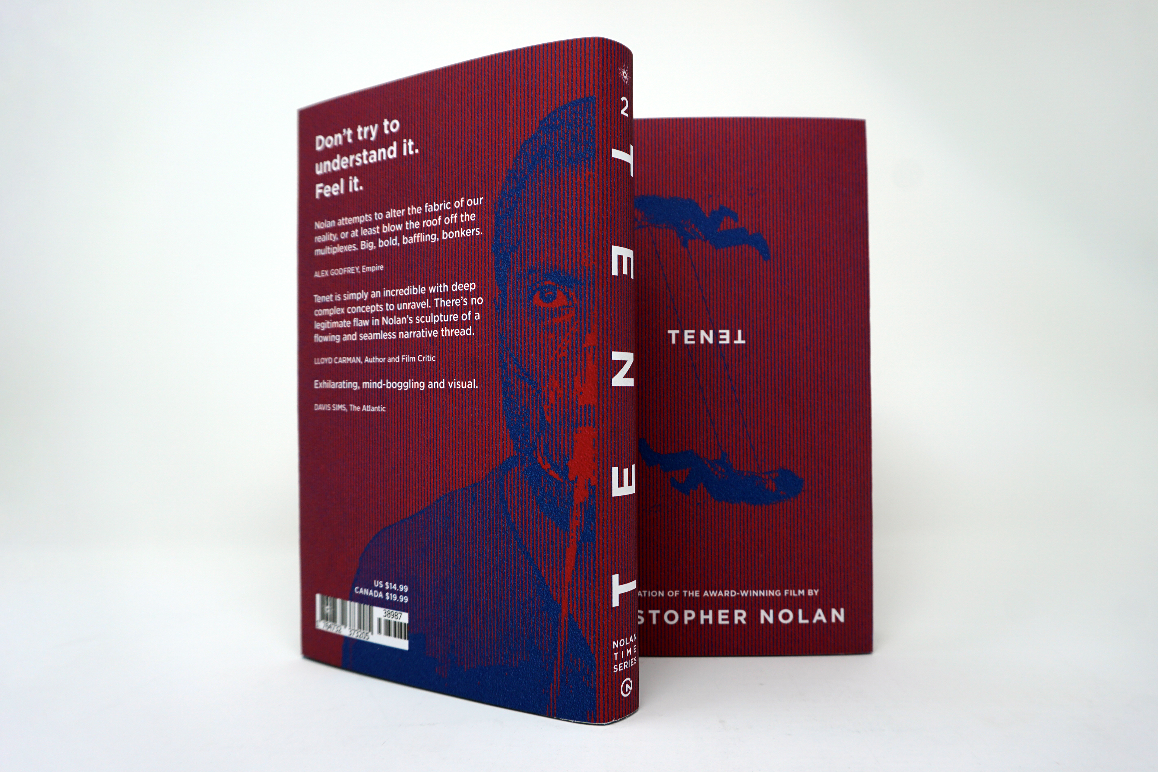
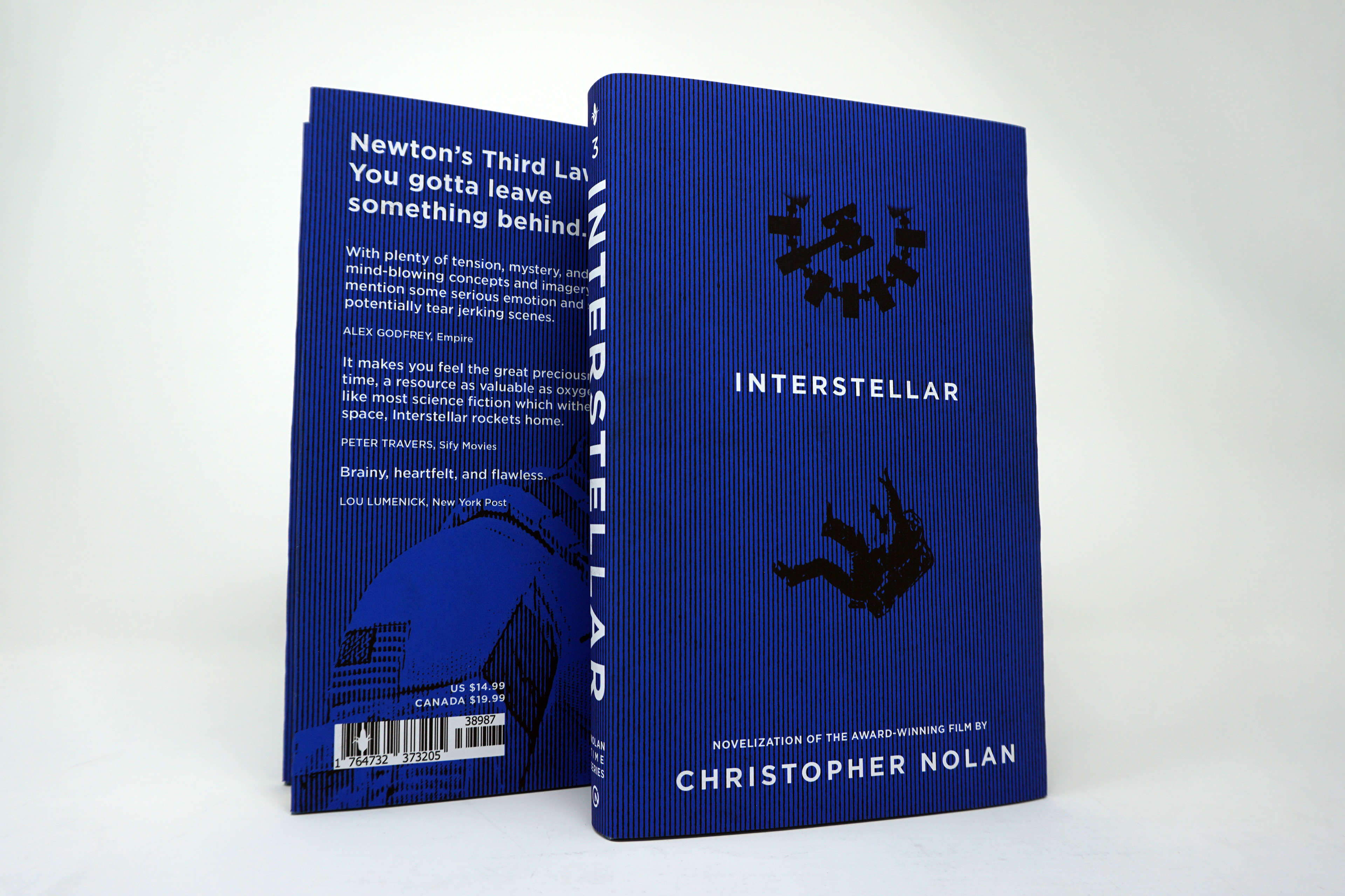
These were concept-focused covers for a series of three books that reflects our interests and emphasizes visual unity. Christopher Nolan directs incredibly mind-boggling films. All of these movies I picked (that I turned into books) have overarching themes of time and time manipulation. I placed these books in order based on how time works: Inception stays in the present and slows down, Tenet goes forward and backward, and Interstellar goes in the future.
I used color, powerful quotes, motifs, and the main characters’ faces to reiterate the conceptual nature of the books. I dove deep into each story to utilize icons to drop little hints about the story, like the spinning top from Inception, the bullet-shattered glass in Tenet, and the corn in Interstellar. The trippy texture used for the imagery and the background match the complicated and hard-to-comprehend storylines. This texture is paired with very simple typography to prioritize readability and simplicity. For the spines, I created a publishing company logo specific to the series using both Nolan’s initials and the hands of a clock. If I saw these in real life, I would in fact judge these books by their covers.
INCEPTION CONCEPTS
Inception by definition is an act, process, or instance of beginning. A commencement. Dom Cobb, played by Leonardo DiCaprio, is a thief with the rare ability to enter people’s dreams and steal their secrets from their subconscious. His skill has made him a hot commodity in the world of corporate espionage. He is offered a seemingly impossible task: Plant an idea in someone’s mind through their dreams.
To exit these dreams, he needs a “kick” to jolt him back into reality, which only works when he experiences the sensation of falling. In the movie, a seated Cobb was "kicked" awake by tipping into a bathtub whilst the dream he attempted to control collapsed. On the cover, I included one of the metropolis dreamscapes to create opposition to the "kick" illustration beneath it. As for the color, I chose an intense red because of the original type color choice for the movie poster.
TENET CONCEPTS
A tenet is a principle or belief, especially one of the main principles of a religion or philosophy. It also happens to be a palindrome (the same both forward and backward). It’s the story of a secret agent named “The Protagonist,” played by John David Washington, on a top-secret mission. He learns to manipulate the flow of time to prevent an attack from the future that threatens to annihilate the present. When someone is inverted, they move backward in time, though from their perception, they are moving forward. The movie shows how they save the world by attacking from both directions of time.
For the cover, I utilized a scene where The Protagonist and Neil (played by Robert Pattinson) cable catapult up the side of a huge building in Mumbai. Instead of showing the building as I did for the Inception book cover, I decided to make them go opposite/towards each other, alluding to the whole "both directions of time" thing. I used the color scheme from one of the most important moments of the movie: on the red side people move forwards, and on the blue side people move in reverse. During this scene, we also see shattered glass from a bullet so I included that on the spine.
INTERSTELLAR CONCEPTS
Interstellar means occurring or situated between stars, or the place where the Sun’s constant flow of material and magnetic field stop affecting its surroundings. This movie takes place in Earth’s future when a global crop shortage and second Dust Bowl are slowly causing the planet to be uninhabitable. Professor Brand, a brilliant NASA physicist, is working on plans to save mankind by transporting Earth’s population to a new home via a wormhole. But first, Brand must send former NASA pilot Cooper (Matthew McConaughey) and a team of researchers through the wormhole and across the galaxy to find out which of three planets could be mankind’s new home. The consequence of this is how time is perceived on each planet and how time passes on earth. It also covers the different relationships and how those are affected.
To match the other book covers, I included the silhouette of Cooper floating away from a spaceship called "The Endurance." Since so much of the movie takes place in this spaceship, and because of its clock-like appearance, it had to be on the front. I also wanted to use the corn icon to hint at the reason why Cooper and Amelia Brand (Anne Hathaway) are up there in the first place: a lack of food. The corn also reminds me of the score by Hans Zimmer of the iconic "Cornfield Chase" when Cooper drives through his farm fields after a drone near the beginning of the movie. The blue color is to help finish off the gradient of the series and because: space.
